A Flutter package to generate customizable pin code fields.
⭐️ to show support!
- Highly customizable
- Responsive
- Supports animations
- Supports autofocus
- Supports autofill
- Supports obscuring text with custom character
Add flutter_pin_code_fields as a dependency in your pubspec.yaml file.
# pubspec.yaml

dependencies:
  flutter_pin_code_fields: <latest_version>
import import 'package:flutter_pin_code_fields/flutter_pin_code_fields.dart';
class MyApp extends StatelessWidget {
@override
Widget build(BuildContext context) {
return PinCodeFields(
onComplete(text) => print(text);
);
}
}Complete example at example/lib/basic.dart.
PinCodeFields(
  onComplete(text) => print(text),
)Complete example at example/lib/obscuring_text.dart.
PinCodeFields(
  length: 6,
  obscureText: true,
  obscureCharacter: "🔴",
  onComplete(text) => print(text),
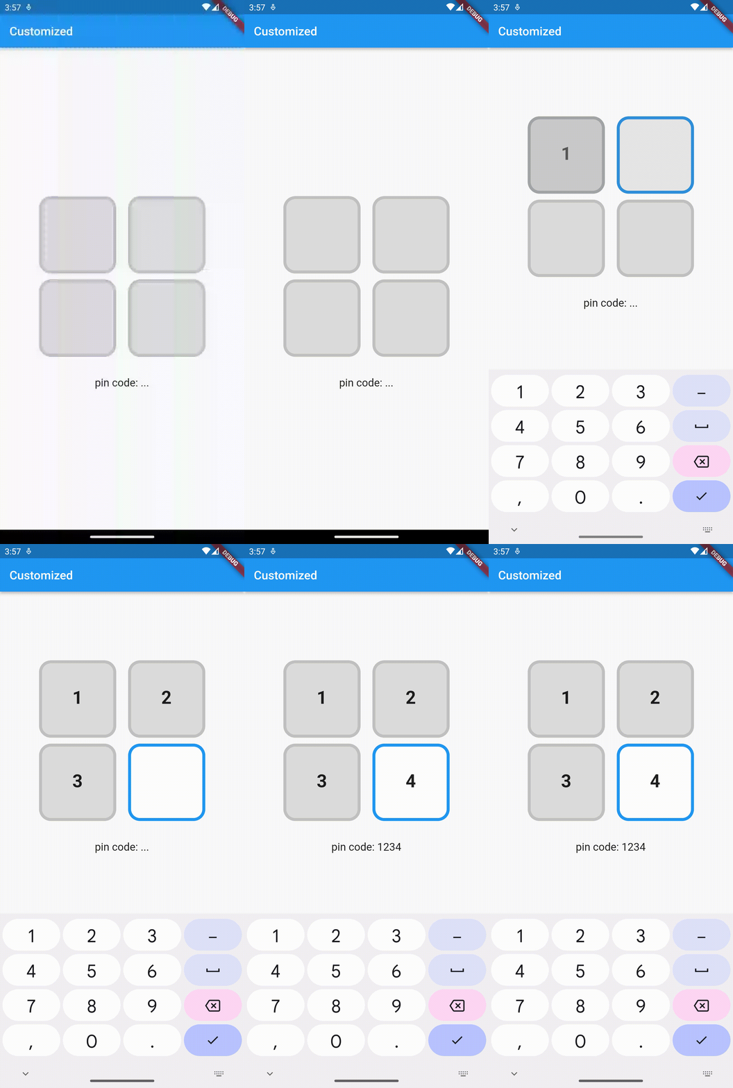
)Complete example at example/lib/customized.dart.
PinCodeFields(
  length: 4,
  fieldBorderStyle: FieldBorderStyle.square,
  responsive: false,
  fieldHeight: 130.0,
  fieldWidth: 130.0,
  borderWidth: 5.0,
  activeBorderColor: Colors.blue,
  activeBackgroundColor: Colors.white,
  borderRadius: BorderRadius.circular(20.0),
  keyboardType: TextInputType.number,
  inputFormatters: [FilteringTextInputFormatter.digitsOnly],
  autoHideKeyboard: false,
  fieldBackgroundColor: Colors.black12,
  borderColor: Colors.black12,
  textStyle: TextStyle(
    fontSize: 30.0,
    fontWeight: FontWeight.bold,
  ),
  onComplete(text) => print(text),
)Complete example at example/lib/animated.dart.
PinCodeFields(
  obscureText: true,
  obscureCharacter: "❌",
  animation: Animations.rotateRight,
  animationDuration: Duration(milliseconds: 250),
  animationCurve: Curves.bounceInOut,
  switchInAnimationCurve: Curves.bounceIn,
  switchOutAnimationCurve: Curves.bounceOut,
)| Name | Type | Default | Description |
|---|---|---|---|
| length | int |
4 |
Total number of pin code fields. |
| margin | EdgeInsets |
EdgeInsets.all(5.0) |
Margin between the fields. |
| padding | EdgeInsets |
EdgeInsets.only(bottom: 5.0) |
Padding within the field. |
| fieldHeight | double |
Height of the field. | |
| fieldWidth | double |
Width of the field. | |
| borderWidth | double |
2.0 |
Width of the border of the field. |
| borderRadius | BorderRadius |
Border raduis of the field. | |
| borderColor | Color |
Colors.grey |
Border color of the field. |
| activeBorderColor | Color |
Colors.blue |
Border color of the active field. |
| fieldBorderStyle | FieldBorderStyle |
FieldBorderStyle.bottom |
Border styles of the field. |
| fieldBackgroundColor | Color |
Colors.transparent |
Background color of the fields. |
| activeBackgroundColor | Color |
Colors.transparent |
Background color of the active field. |
| enabled | bool |
true |
Enable/ disable editing the fields. |
| responsive | bool |
true |
Adjust the size of the fields automatically to the available space. |
| autofocus | bool |
false |
Enable/ disabled autofocus. |
| textStyle | TextStyle |
Text style for the fields. | |
| obscureText | bool |
false |
Enable/ disable obscuring the text in the fields. |
| obscureCharacter | String |
* |
Character to obscure the text in the fields. |
| keyboardType | TextInputType |
TextInputType.visiblePassword |
Keyboard type. |
| inputFormatters | List<TextInputFormatter> |
Input formatters for the fields. | |
| autoHideKeyboard | bool |
true |
Hides the keyboard automatically on complete. |
| animation | Animations |
Animations.fade |
Animation for the fields. |
| animationDuration | Duration |
Duration(milliseconds: 150) |
Duration of the animation. |
| animationCurve | Curve |
Curves.easeInOut |
Animation curve. |
| switchInAnimationCurve | Curve |
Curves.easeIn |
Switch in animation curve. |
| switchOutAnimationCurve | Curve |
Curves.easeOut |
Switch out animation curve. |
| controller | TextEditingController |
Text editing controller for the fields. | |
| focusNode | FocusNode |
Focus node for the fields. | |
| onChange | ValueChanged<String> |
Callback that returns text on input. | |
onComplete [required] |
ValueChanged<String> |
Callback that returns text on filling all the fields. |


